Yeah! I finally got my second COVID-19 vaccine and downloaded the CovPass-App, so I could forget about the little and nice yellow Impfpass -vaccination book- that Germany provides.
I have to say that as a fan of digitalization, I was really surprised when they launched the app. Germany loves paper documentation. But I also believe they should have done that before, I mean when the vaccination campaign started. Why? Because people have a double job: go to get a jab and now go to a pharmacy in order to get a digital certificate when they are fully vaccinated.
That said, at least we have the chance to have it and use it without thinking of the paper version. Also, you can hold your negatives test and a certificate of recovery.
So, I opened the app and… yes. I changed the hat I was wearing, my UX writer and designer role came out and violà… decided to review and suggest a new user onboarding.
Let’s see:
First screen
A good start. I see the image and understand which kind of information I can store on it.
But… why do they provide just one arrow to the left and not the right? and just Weiter – Continue?
I see 4 dots. Uff… a lot of screens (3 should be ok!). But maybe useful information. However, the first problem that I detect here is the word “Schritt” or step. The text doesn’t say clearly what I have to do, it says at least 3 times the phrase “COVID-Zertifikat”. Where should I scan it? Not sure. The vaccination book doesn’t have any QR code, not every test result has a code and I guess same with the medical certificate when you overcome the virus. So, I need a little more information to re write it.

Second screen:
Repeated information and long text don’t help users to make the process easy and effortless. People don’t like to read that much when using an app and particularly before using it.

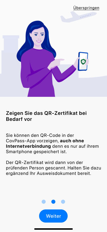
Third screen
Actually, it seems quite obvious that the app is designed to show the certificate when and wherever is needed. So, I wouldn’t explain that again in that way.

Last screen:
We have to accept the terms and conditions on data protection and alles klar – understood!

My suggestion
Fewer screens, reduction of the amount of text, review of content and font size, and also UI elements. See and try the mini prototype here.