As its name says, the TangoPartner app is a tool to find partner/s to dance with. That means, attending classes, festivals, or milongas (tango parties).
By using this app, tango dancers (from beginners to professionals and teachers) can have a profile, set what they are looking for, find and connect with people and also find milongas.
It seems that users can also perform other actions, but I will deepen this during this short and quick evaluation.
Visibility of System Status
We like to know where we are. Does it app provide it?
In a way, yes. The thing is that sometimes it is a bit confusing.
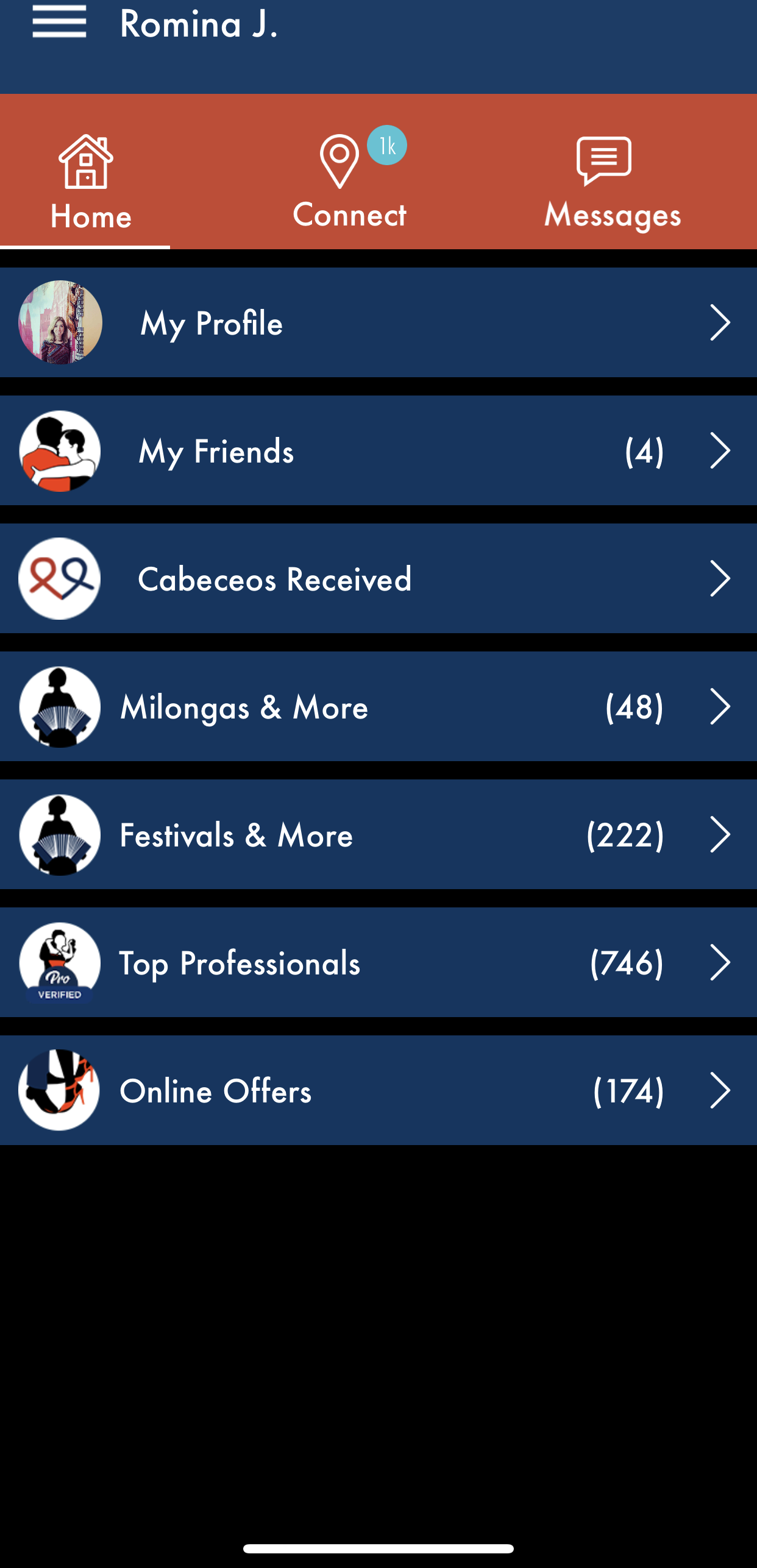
This app has a menu on the top, that disappears when clicking on anything.
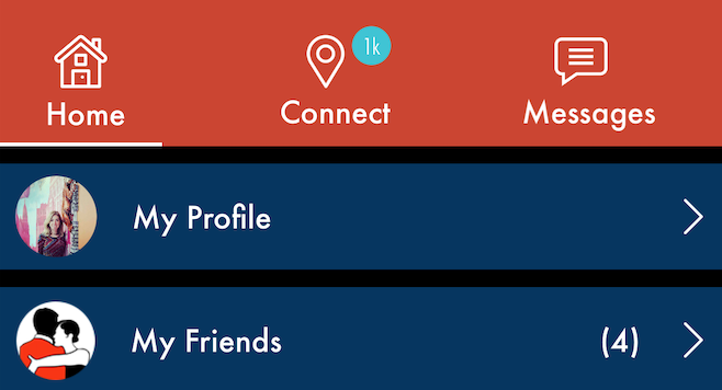
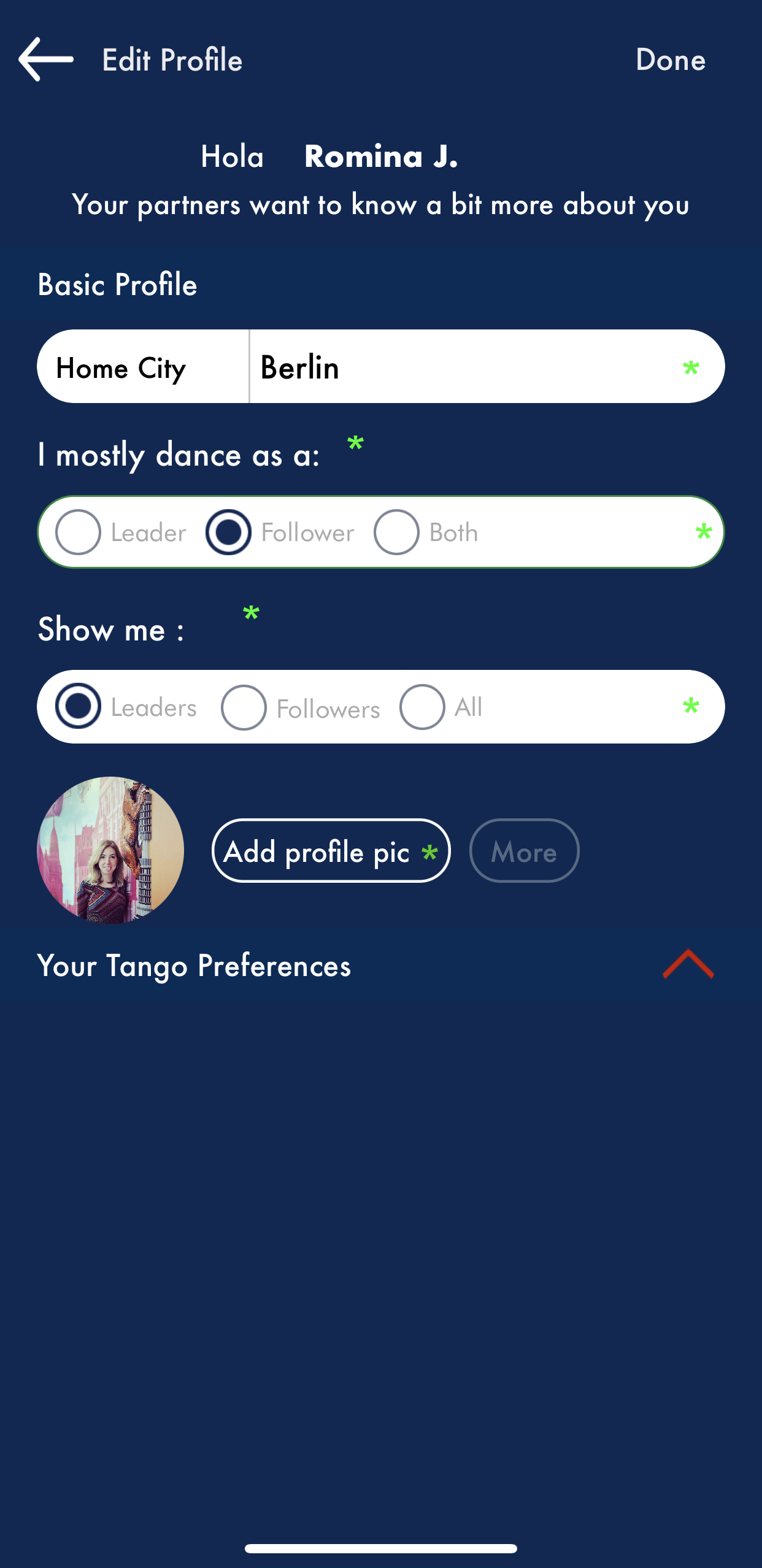
When clicking on “My Profile”, we can’t see our profile, but we can edit it. And if we want to go back, we have to click on “Edit Profile” and that is actually confusing.
When loading a section, we just see the icon but no more information and sometimes it takes longer to see any information.
The Match Between The System And The Real World
Here the app missed the chance to match the real tango world and its system. For the “Connect” option, the app shows a classic localization icon. For “Milongas and more”, we have the same icon as in “Festivals and more”. Also, what the word “more” means here? And “Online offers” don’t match either.
Usually, a tango dancer looks for partners, classes, workshops, milongas, festivals, shops for shoes and clothes, and also teachers.
These categories are a bit mixed and cause just confusion.
User Control And Freedom
We can find the way back easily with back arrows that will lead us back to the homepage or the main menu when entering a workshop or a friend profile.
But the user control and freedom end there. We can’t select messages to delete in a conversation.
We can’t see our own profile. We have the option to upload more than one picture, but we can’t decide which one to show first or delete some of them.
When looking for partners, we have to choose our preferences in our profile, but there is no filter on the search page.
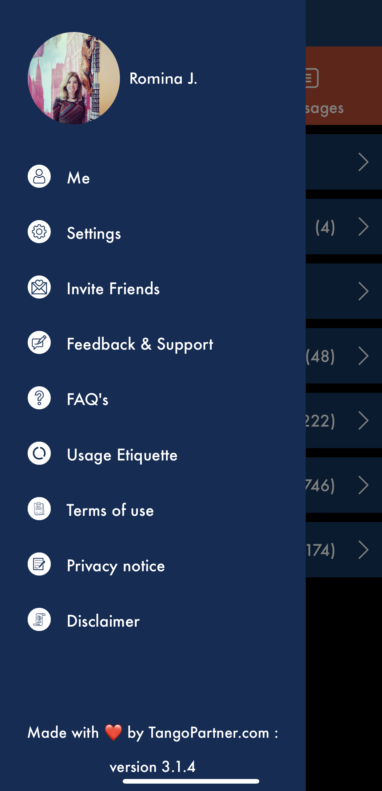
For some reason, we can set our partner distance by clicking on “Settings”, an option we find own he burger menu.

Consistency And Standards
This app lacks some consistency, as the main menu disappears when clicking on a section.
Also, the standards are there for all the possible things we can do with the app, but sometimes it is hard to find because they are located in unexpected places. It should be better to have the option to filter our search for dancers and not have some setting on our own profile or on the settings section where you can also set your notification ups. A little bit of reorganization would improve the user experience by making it clear and less confusing.

That being said, most icons are confusing because don’t match our expectations. There is an arrow that should open more options, but we see the opposite.
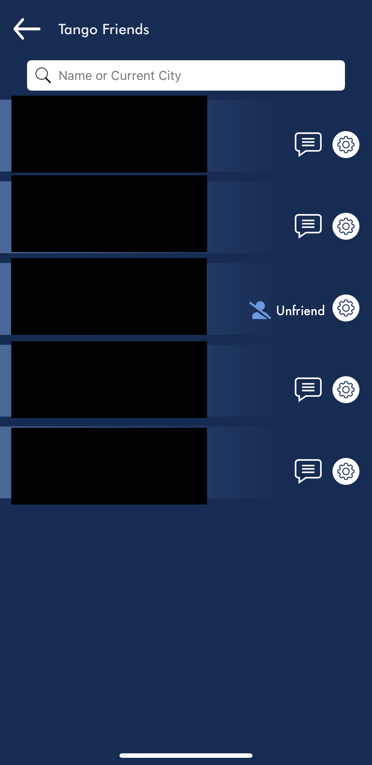
We have a settings icon for deleting a friend, no other settings are possible.
When sending a “cabeceo” to connect with someone, we don’t get any confirmation, just that when doing this on the result page, the profile just goes away. And when doing it on the user’s profile, we don’t get any information.
I should also make some notes about the copy. It should be checked and rewritten, as for some reason some words are in Spanish.
Also, for example, when viewing the list of potential partners, “more” is written in each profile, when it could be just “view”.
Are we Friends? Is that the correct word to call us when looking for a dance partner? Why do we see the Friends world on the home screen but “Tango Friends” when inside this category?
Error Prevention
It takes time to find a partner o dance with. We need o have some chemistry, and of course, time to meet and practice. So, after requesting people to connect… we can easily make a mistake and “unfriend” her/his. When seeing your contacts, you have an icon typically used for settings and when clicking there, you can choose to “unfriend” a person and by clicking this, there is no confirmation required. Suddenly, you dance alone.
I don’t even try to “delete account” option on “Settings”, just in case I miss the chance to finish this post.

Recognition Rather Than Recall
As I said before, this app should redesign its information architecture to avoid recalling that much, as many functions are mixed among categories and sometimes it doesn’t make sense (as mentioned with the filters and settings to find a dance partner).
Flexibility And Efficiency of Use
TangoPartner could be easier to use by having better icons and by maintaining the menu on every screen.
Aesthetic And Minimalististic Design
I am still asking if blue and red are the best tango colors. Is there any tango color out there? I think about fileteado and some typical paintings with fileteado that have more red, gold, and light blue. That could be more suitable.
Help Users Recognize, Diagnose, And Recover From Errors
The only message I found to recognize and prevent errors is the message shown before deleting a conversation.

Help and documentation
There are some “Usage etiquette”, that users can find when clicking on the burger menu, about how to behave if we are looking for a tango dancer. There is a FAQ section whit some information on how to use the app and a short contact form to get some help/support and provide feedback. (Should I send them this link? The last update of the app was in 2020!)
