Canva has been, for a couple of years, one of the platforms I use the most to design all kinds of posts, presentations, and materials I use to work with. I use the desktop version and the app to make small changes but not to design from scratch. For this project, I had the nice opportunity to deepen my knowledge of the app version and work hand in hand with David, a friend and great UX professional from Argentina.

You can access the whole case study on Behance.
In this case study, we delve into the journey of improving the Canva app’s user experience. By employing various research and design techniques, our goal was to identify pain points, enhance usability, and create a more intuitive and enjoyable design experience.
The Collaborative Effort
This project was a collaborative effort between a dedicated project manager and myself. Together, we embarked on a comprehensive UX journey to transform the Canva app.
Understanding User Needs
Our first step was conducting extensive UX research. We aimed to get inside the minds of Canva users to understand their pain points and desires. Through surveys, interviews, and usability studies, we gathered valuable insights.
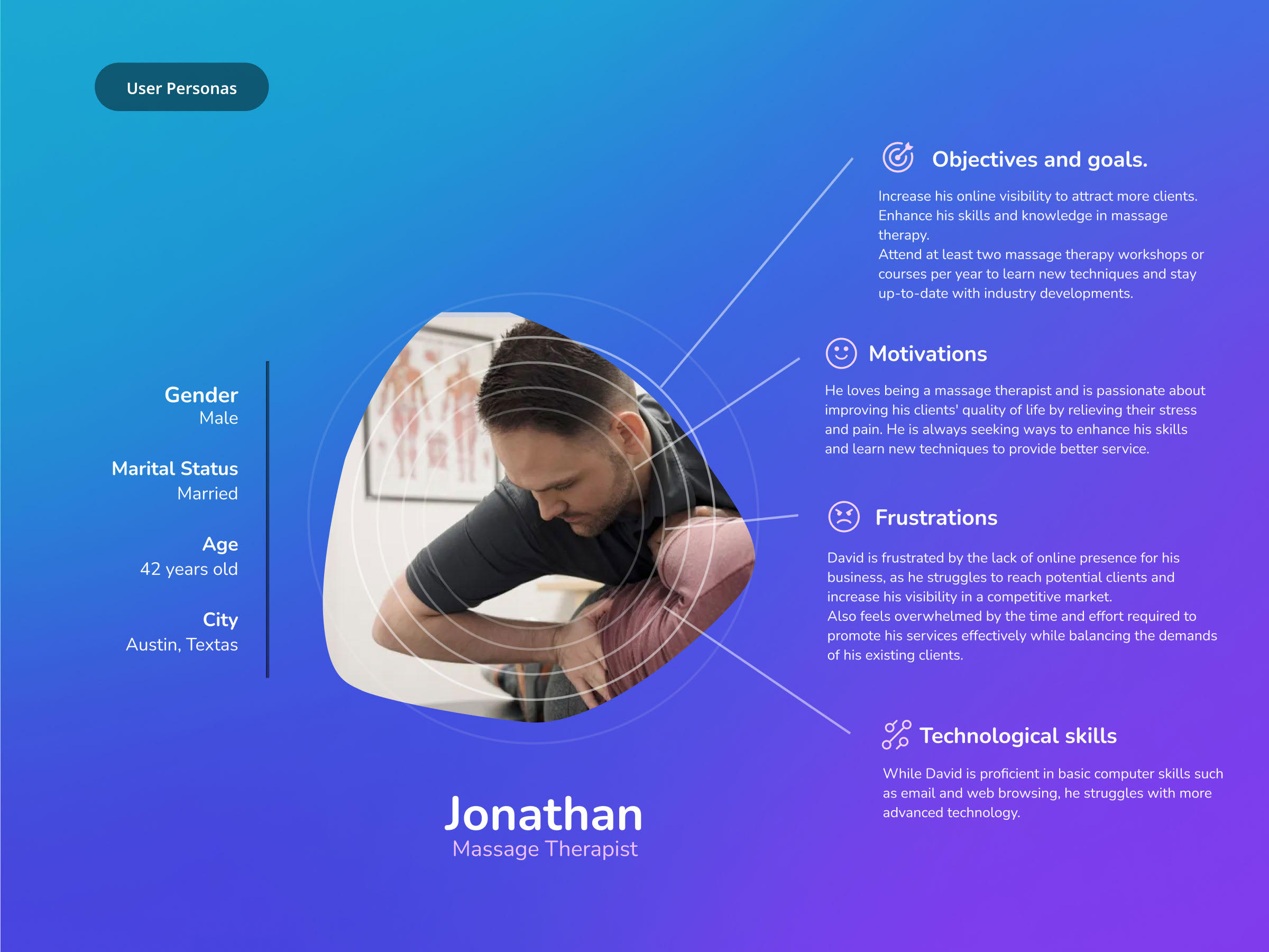
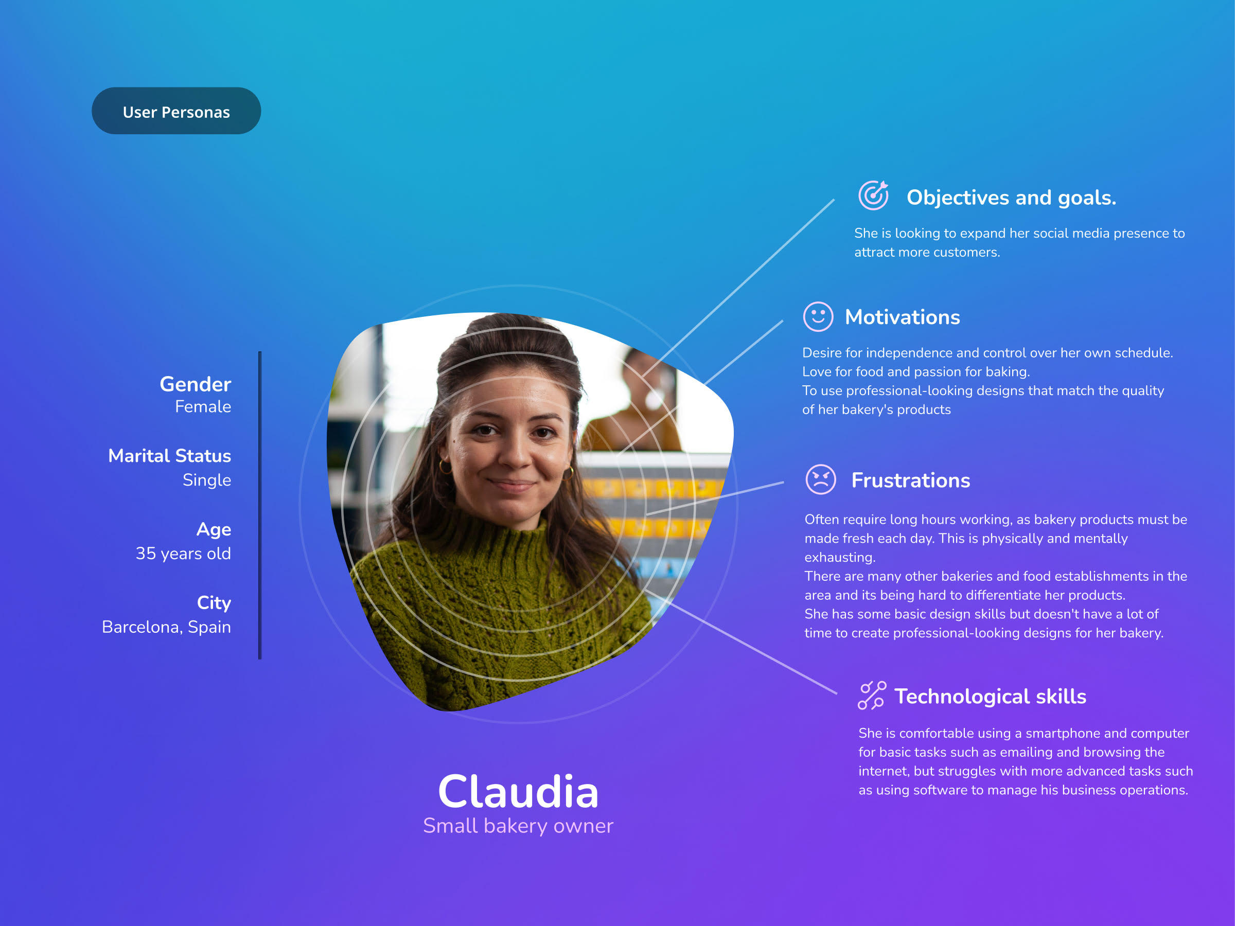
Creating User Personas
To personalize our approach, we created user personas that represented Canva’s diverse user base. These personas helped us empathize with users, making it easier to design with their needs in mind.


Benchmarking Analysis
We didn’t stop there. We conducted a benchmarking analysis to understand how Canva compared to its competitors. This allowed us to identify areas where Canva excelled and where there was room for improvement.
Visualizing the User Journey
One powerful tool in our UX arsenal was the creation of a user journey map. Visualizing the user’s path through the app helped us pinpoint pain points and areas where the experience could be enhanced.

User Testing
Our journey reached a crucial milestone with user testing. By observing real users interact with Canva, we gained invaluable feedback. This feedback was instrumental in shaping our recommendations.
Key Findings and Insights
Our journey through the Canva app uncovered several key findings and insights:
1. Market Share and Competition
We recognized the competitive landscape, where some rivals boasted extensive stock libraries and years of experience. Notably, Microsoft Designer, with its AI-driven design solutions, emerged as a formidable competitor.
2. Segmentation
Understanding user needs and skill levels led us to consider segmentation. Tailoring Canva’s offerings to distinct user groups could significantly enhance the UX.
3. Mobile vs. Desktop
We acknowledged the disparity in the mobile and desktop experiences. To bridge this gap, we proposed a wizard-like element manipulation approach, making editing more accessible for beginners and non-designers.
4. Templates and Outcomes
The abundance of templates can be overwhelming. Leveraging AI to generate personalized starting points based on user prompts could save users considerable time while harnessing Canva’s collaborative template library.
Conclusion
The Canva app remains a powerful tool, empowering users to create professional-quality visuals for various purposes. However, our journey highlighted areas where improvements are needed to address user concerns more efficiently, particularly in the face of emerging competitors.
In a market saturated with design applications, Canva’s dedication to improving the user experience will be pivotal in maintaining its position as a user-friendly design solution. By segmenting users, optimizing the mobile experience, and harnessing AI, Canva can continue to empower users and drive innovation in the world of digital design.
As the UX landscape evolves, Canva has the opportunity to lead the way with thoughtful enhancements that cater to users’ unique needs and preferences.


