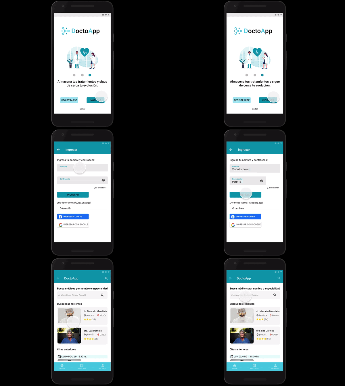
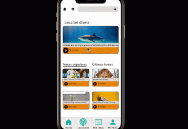
DoctoApp is an Android App that allows users to look for doctors who treat particular conditions, book a medical appointment and store their prescriptions and medical checks (blood test, ultrasounds, etc.).
The platform is designed for adults in Latin America, particularly those who suffer chronic or autoimmune diseases.

Duration: 2 weeks
Solo project role: UX/UI designer
Objective: design a mobile app that helps people find a doctor who treats special conditions.
Tools: Balsamiq, Google Drive, Miro, Figma, Zoom
To design DoctoApp, I followed the Design Thinking Process

1- Empathize
To understand the market and what other related apps offer, I conducted a Competitive Analysis and tried out 3 apps.

I also tried a hospital website that offers the option to book an appointment, which is very used in one Latinamerican country.
After this initial research, I concluded that these apps don’t offer a way or easy one to find a doctor specialized in a particular condition nor to store medical history (tests, medical prescriptions).
Whit this information in mind, the next thing I needed to know was:
what do the potential users of DoctoApp think?
I conducted a few remote user interviews.
Some of the questions I prepared were:
-How do you find a new doctor?
-How do you book an appointment?
-Do you ask for recommendations?
-How do you manage your prescriptions and results of tests/studies?
-Tell me about the last time you went to a doctor.
After analyzing the interviews, I created an Affinity map to clearly see my findings:

The research revealed that most users Internet (website) or an app to book an appointment and that they ask for recommendations. Also, that they don’t like wasting their time going to a doctor when they can’t help them with a particular problem.
2- Define
Once I understood my users’ needs, I created a persona: Verónica.
She helped me to design for real people.

At this point, the initial goal and the initial question led to a narrowed problem statement:
Verónica needs an easy way to book a doctor appointment that can help her with particular problems or healths conditions, as well store her medical history, because she has an illness that requires regular checks and particular issues she needs to keep an eye on.
3- Ideate
Having her and her needs in mind, I started to think of possible solutions. Time to outline the user journeys, stories, and tasks Veronica would take to complete her goals!


4- Prototype
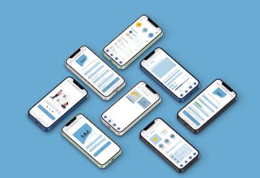
After that stage, I started designing the wireframes and creating the first prototype.

To make it more appealing I create a second prototype with a more realistic look.
While enjoying this ideation and prototyping time, I was asking myself if this app is easy and useful and if it would help users like Verónica to solve their problems when booking a medical appointment.
That meant one thing: testing time!
One of my favorites parts of the process 🙂
5- Test
Ready to receive all the possible feedback that could help me to improve DoctoApp,
I conducted 4 remotely online usability testing.
I’ve created 4 scenarios and tasks, which provided me with a lot of valuable information to find errors and gather users’ opinions.
After that, I categorized the errors according to Jakob Nielsen’s error severity rating scale (being 0 not a problem at all and 4 a usability catastrophe) to help me prioritize the improvements.

After that, I took into consideration the results of the usability testings and improved the prototype. Some examples of a few changes:

I improved the usability and hierarchy of the titles. And for the examples in the search box, I added the word “example” and put it in italic.

I added the search box into the “Mis citas” screen when a user doesn’t have an upcoming appointment, so they don’t need to go to the home to search for one. And also added a button to book again with a previous doctor.
I wanted to keep the screens with little text, but some users thought they should select a category to upload content, that’s why I decided to include a title to avoid confusion.

Some people interpreted “mañana” as “tomorrow” and not “morning”, so I decided to change it to avoid mistakes.
To make the UI even more consistent, I changed the color of some CTA.

Access to the updated clickable Prototype
Design Language System


What’s next
- to add a feature to add family members. That could be useful for parents.
- to improve the way users can share a doctor’s profile. That could be good for those you like giving or receiving recommendations.
- to improve the doctor’s profile. In order to add more information about the doctor or office.
Learnings
- designing a medical app is important but also risky, as health is an important aspect of each person.
- managing personal information is a vital aspect to make the users feel the app is safe.
- enjoy every step of the process!
- never forget I’m designing for users that behave in a completely different way as I would do.
- always be open to feedback.
You can see/download the PDF with the case study here. You can also visit my Behance profile!


