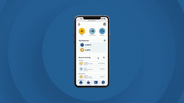
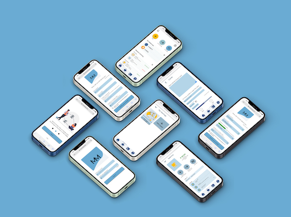
MyMoney is a digital wallet that allows users to manage their finances smoothly, safely, and efficiently. Users can deposit, exchange and store different currencies, receive and send money, and create saving goals. All in one app and in simple steps.
The platform was designed for young adults all over the world who embrace technology as a way of living. It was the main project of my amazing UX learning process at CareerFoundry, tutored by Mariem Abdullah and mentored by Szumiao Chen.

To design MyMoney I followed the Design Thinking Process.

1- Empathize (or how to understand what and why I’m designing for)
During this first stage, I needed to research and gain an empathic understanding of the problem I was trying to solve: How might I design a digital wallet that allows people to pay, receive and store money effortlessly?
As I wanted to understand the market and to know the potential users, I conducted a Competitive Analysis (Xapo and Paypal) and a UX analysis.
I chose Xapo because it offers a wallet that included cryptocurrencies and I wanted to see how it works, as I wanted to offer my users the option to buy and store crypto.
On the other hand, Paypal is a very well-known platform to send and receive money, pay online, and store money.
Competitive Analysis


UX Analysis
In order to understand better some UX aspects like CTA, Navigation Structure, and Usability, I decided then to go deeper and analyze Paypal.

At the end of this first step, I had a better idea of the available services. I checked a few more apps and I discovered that they have different targets and don’t offer a way to handle all finances efficiently and smoothly. Just to mention one example, if a user wants to send money abroad via Paypal, he/she has to connect the account with a different service, Xoom.
To make sure if what I had found was true, I moved to the next step: ask and get to know the users.
Without knowing the users’ needs, pain points, frustrations, and experiences, I couldn’t design a solution tailored for them; so, I started collecting useful information. I used two methods: surveys and interviews.
Interviews
After gathering the survey’s findings, I conducted 4 interviews.
My goals were:
- to identify pain points, uncovered needs
- to understand how they think about safety and security
- to understand if they use apps or digital platforms to manage their money, and in that case, how
I prepare some questions for the interviews, for example:
- Did you change your consumption habits since the pandemic started?
- Which tools do you prefer to use to handle your money and to manage your finances?
- Do you use apps or websites to send money, pay or manage your money?
- Why do you use that method/platform?
- Tell me how you use that/those apps.


2- Define or how to narrow the problem by having the users’ needs in mind
With all the data collected, I could sort and map it using affinity maps, and then created User Personas, which helped me to think about the users as real people.

After that, I narrowed and defined the Problem statement:
Users need a way to securely and easily manage their entire finances digitally (to make online purchases, receive, pay, send, exchange, and save money) because traditional payment methods such as cash and cards are decreasing, driven by the COVID-19 pandemic. They need an alternative to traditional bank accounts/cards.
Some challenges I had to face:
- as safety was one of the key points for users when using platforms to manage their money, I had to provide a safe solution treating privacy and data security with the greatest care
- for most users sending money across borders was crucial and they felt frustrated whit the services they used, so I needed to make international transfers transparent, easy, and intuitive
- users would like to have just one platform to manage their whole money, I need to build a simple and clean design ensuring main features are accessible at a glance
3- Ideate or how to face the challenges and come up with a solution
Focused on the users’ needs and came with this idea:
A secure and intuitive web app that allows users to have a digital wallet to make payments, transfer money in an agile way with minimal fees, exchange, save and store money. It also will let them keep track of their expenses, which will be automatically categorized.
The idea was to provide clean screens with the most important and familiar information a user needs to manage money:
- current balances
- recent activity with a search bar and clear in/outcomes
- main action buttons to add money, send money, pay and exchange
- simple process to achieve each task
To start ideating the solution, I created:
User Journey Maps

User Flows
Information Architecture and Card Sorting results

During the whole process, and as I kept improving this solution, I revised and updated several times the Information Architecture.
4-Prototype or how to flesh out ideas into visuals
I was now ready to grab paper and pen and think in a visual way. The first wireframes came to life. And the iteration design never stopped. I focused on the mobile version but also created a desktop version.
Low fidelity wireframes

Before testing the prototype I iterated the design several times until I thought I managed to provide a way to accomplish the main tasks in an effortless way:
store different payment methods and currencies, send and save money.
Mid fidelity wireframes

I was prepared to receive all possible feedback, test the prototype, see how users interacted with it, and observe which problems they faced to learn from them and iterate the solution again.
5-Test or how to discovered what works and what doesn’t
For the usability testing I had 2 big goals:
-to assess the learnability for new users interacting with the digital wallet platform for the first time on the mobile version.
-observe and measure if users understand the app, its value, and how to complete basic functions. Also if they consider the platform secure.
After enjoying 6 wonderful remote sessions I collected all feedback. I realized I made several mistakes, so I categorized the findings and errors and went back to improve the wireframes and the prototype.
Usability Testing Results

And more testing! This time, as the fidelity of the prototype increased, I did a few
Preference testing

Refine and polish the prototype… to more iterations and beyond!
At this stage, I continued improving the prototype based on:
- the usability testing feedback
- what other students told me when practicing amazing collaborative design
- productive talks with my mentor
The main issues were on the homescreen:
the feedback helped me understand the errors I made trying to provide a very minimalistic screen and I learned the importance of implement features the users can find without thinking. Between each iteration, I asked for feedback and did quick usability testing.

After that, I focused on put all the UI elements altogether:
Design Language System


Last updated version: try the prototype!

What’s next
For the next iterations I’m considering some ideas, for example:
- do more research and testing to simplify the send money options.
- implement a discount and offers features to enhance engagement
- improve the Statistics feature to include a prevision of future expenses
Learnings
During the 4 months I’ve learned a lot, some learnings are:
- iterations and research go through the entire design process
- a UX designer doesn’t have to be afraid of trial and error but embrace it. It helps improve the solutions
- the importance of conducting usability testing every time it’s possible the whole process
- avoiding assumptions and practicing active listening are two key aspects to empathize with people
You can see/download the PDF with the case study here. You can also visit my Behance profile!


